Bieffe Marketing
A major brand identity restyling for a digital agency that works with clients to improve their online presence. In doing this, they improved their presence, too.
Sector
Web & Digital Services
Discipline
Brand Identity


Brief
Bieffe is a digital agency that helps both big and small business to work on their online presence. With more than 10 years of experience, Bieffe works with clients from everywhere. I have been invited to redesign their digital brochure and to refresh their identity, too.


Rationale
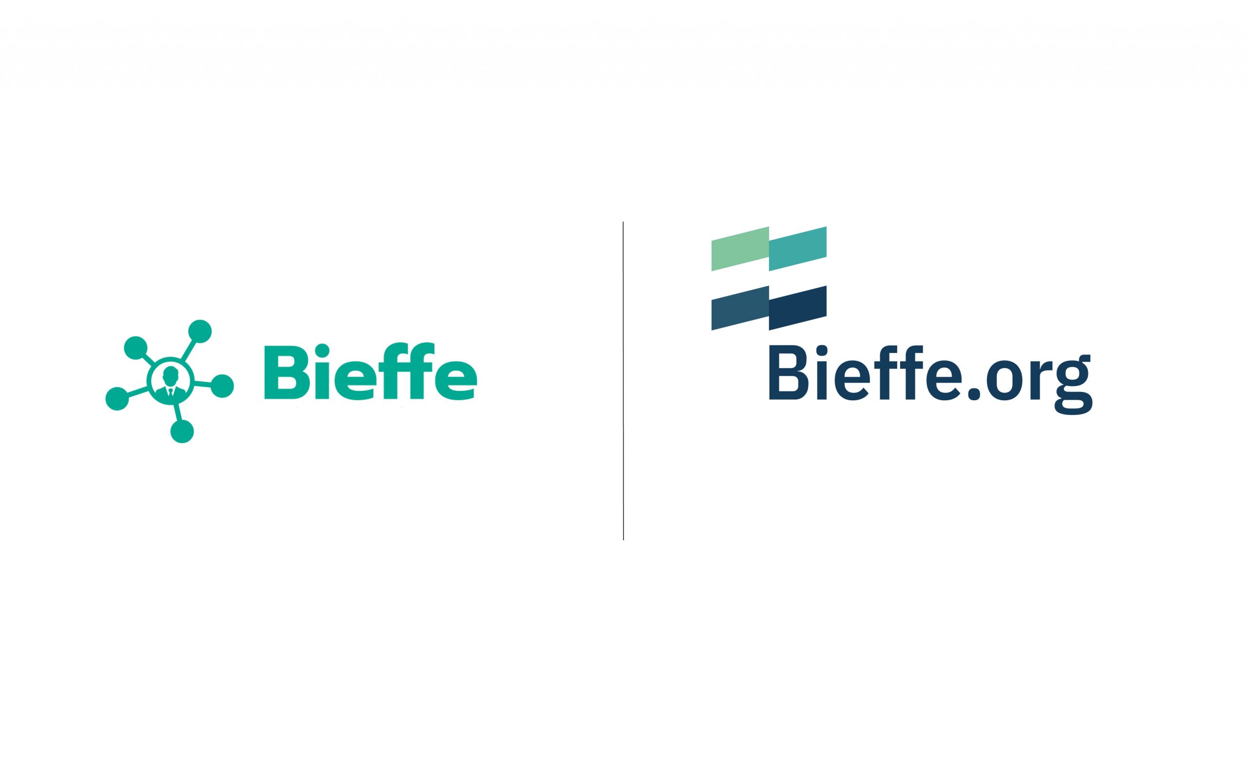
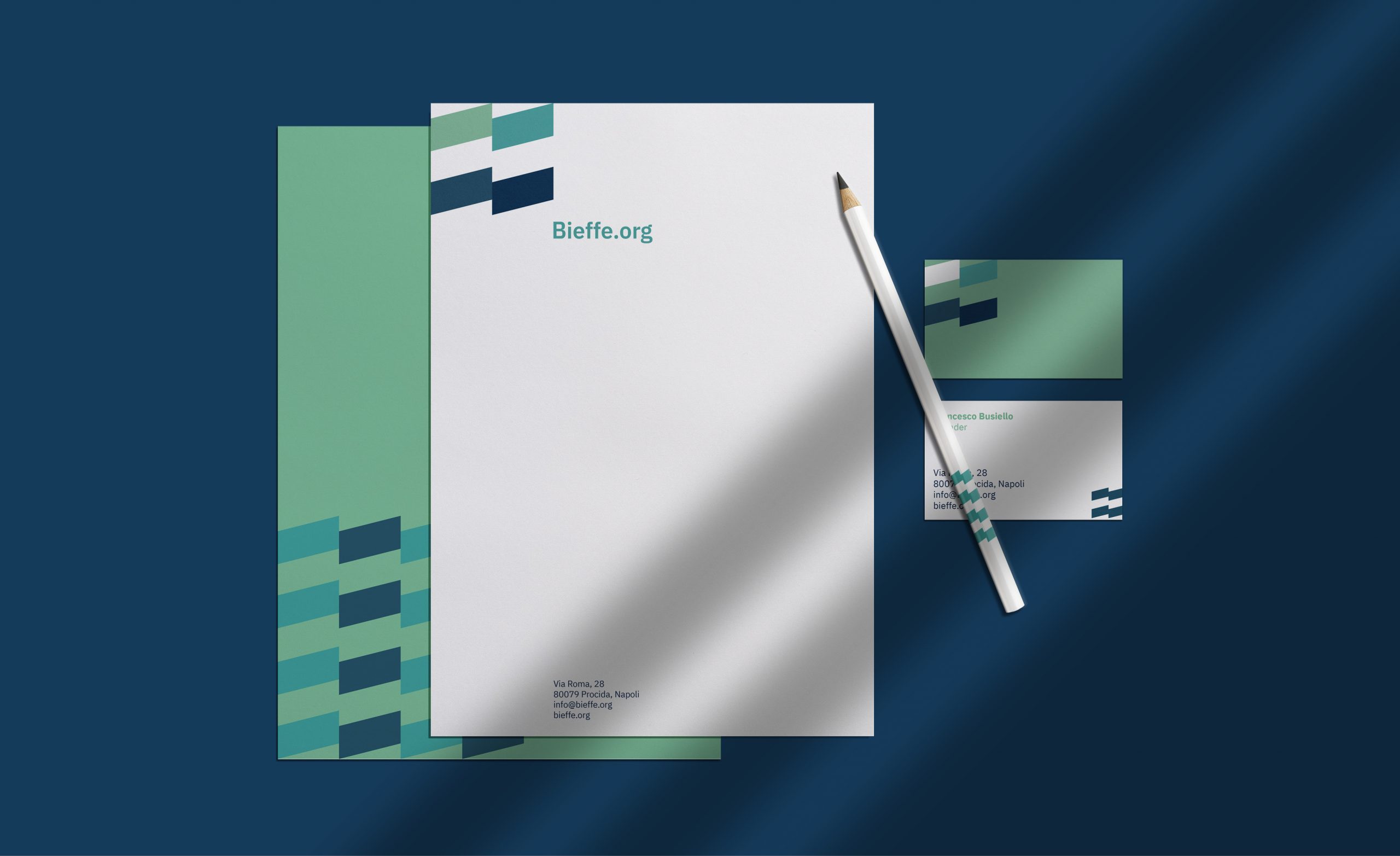
The creative process and the strategic research led me to redesign the symbol by including the “B” and “F” letters, to create a monogram. I also wanted the pictogram to inspire a sense of growth. Nothing else was required. The color palette was uneven: I decided to improve it by changing the turquoise color and by adding three new ones. The refreshed color palette is decise and confidence-inspiring.

Output
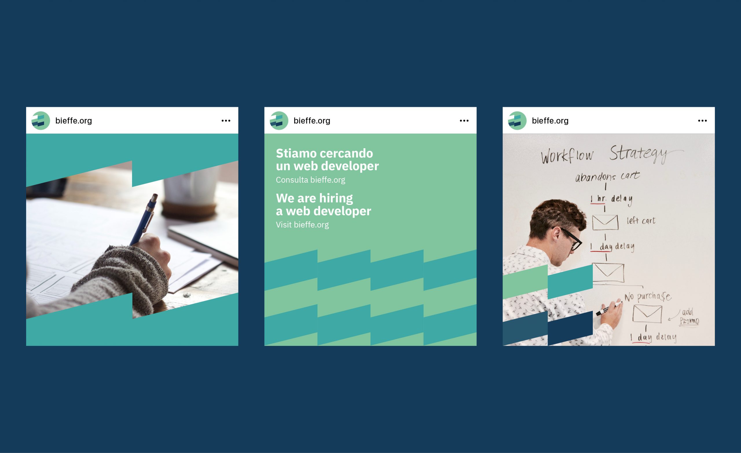
The new image of Bieffe is clear, geometrical and reflects the brand’s values: precision, organization and growth. Bieffe is a reliable structure, just as its new identity. This new look helped the team in the dialogue with new clients and make the business stronger, improving the brand’s position.
More Projects


