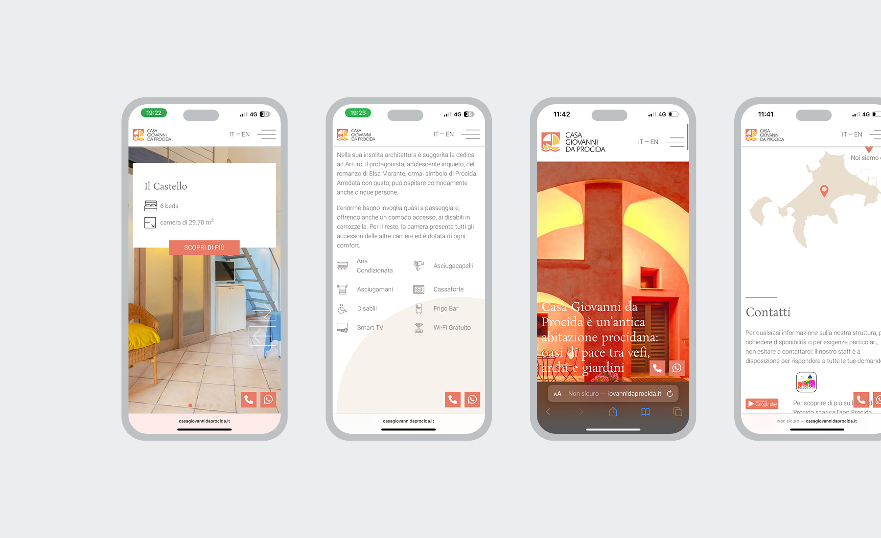
Casa Giovanni da Procida
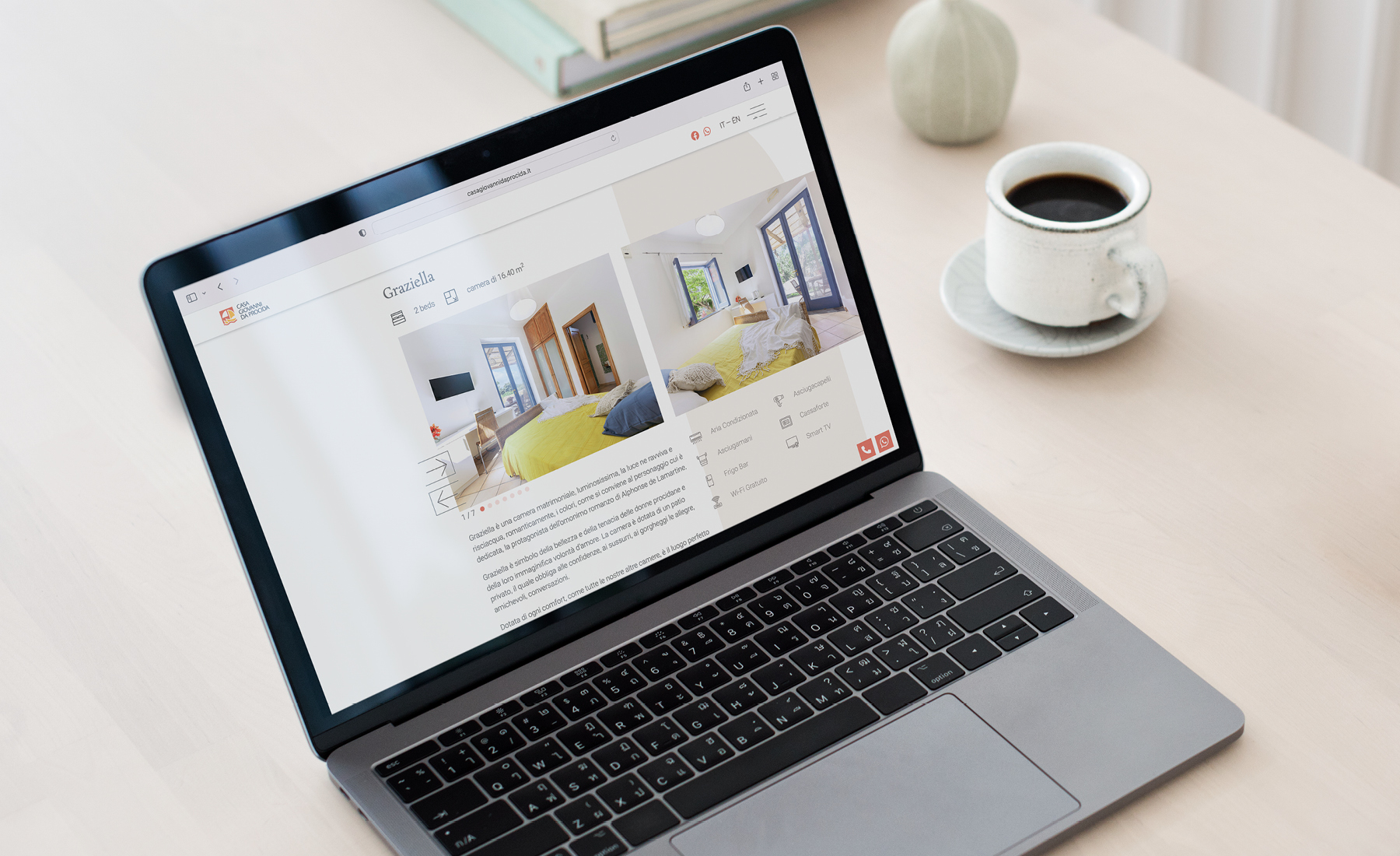
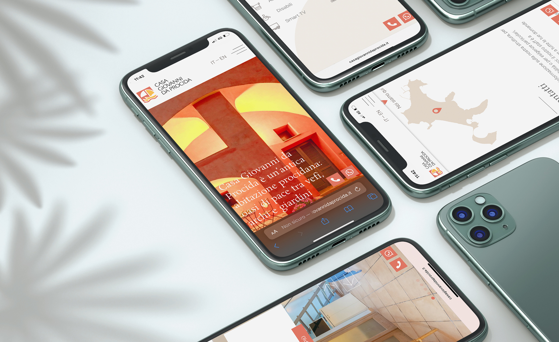
The typical architectural style and the colorful palette of Procida are the key elements involved in the design of the website of Casa Giovanni da Procida, a peaceful and family-friendly hotel, surrounded by a cozy garden where relaxing is the only option.
Discipline
Web Design
Sector
Hotel & Hospitality
Info
Procida, 2022
Brief · Analysis
When I visited the hotel for the first time, I immediately understood which its strengths were: a perfect position (in the middle of the island), a quiet and relaxed atmosphere, a peaceful garden and, last but not least, its unique architecture, typical of Procida island.

Rationale · Design
In designing the website, I decided to focus on arches, windows and doors: the key elements of the hotel's architecture. I also wanted the contents to be clear and easy to reach, so I studied a simple sitemap in which everything was well-balanced: texts, images and visual assets.


Output · Result
The website looks modern but retains the traditional style of the hotel: the shapes enhance its architecture without making the website difficult to read. The lively color palette recalls Procida. The responsive layout makes it easily navigable on smartphone and mobile devices, too.
More Projects


