Power Gym
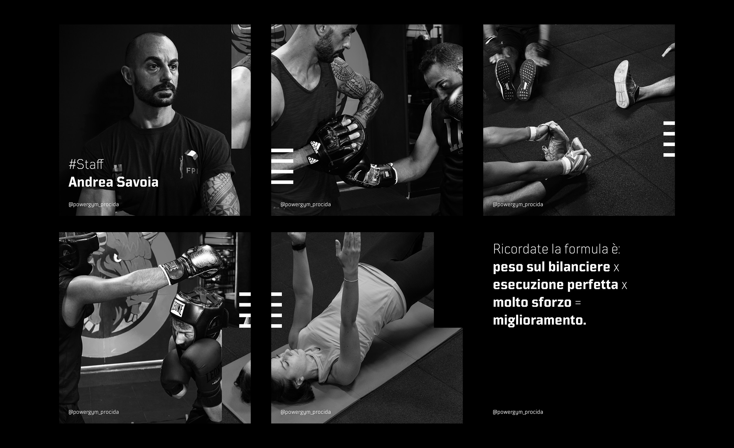
Square typography and an extremely dark color palette to give Power Gym an impactful welcome on social media. A brand new attitude that reflects the gym’s approach.
Discipline
Digital, Photography
Sector
Health, Sport
Info
Procida, 2020
Brief · Analysis
Giovanni Guida, the founder of Power Gym, explained me the need to get closer to his clients at the gym. What he wanted, was to create a powerful atmosphere that reflected the dark shades of his place. My task was to introduce clarity and a powerful impact on social medias.
Rationale · Design
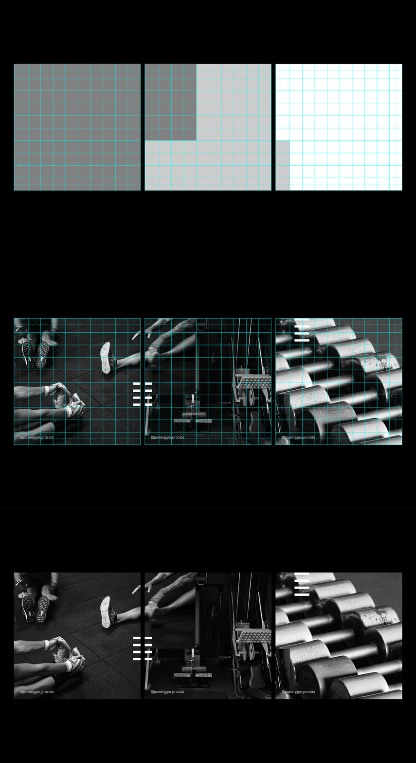
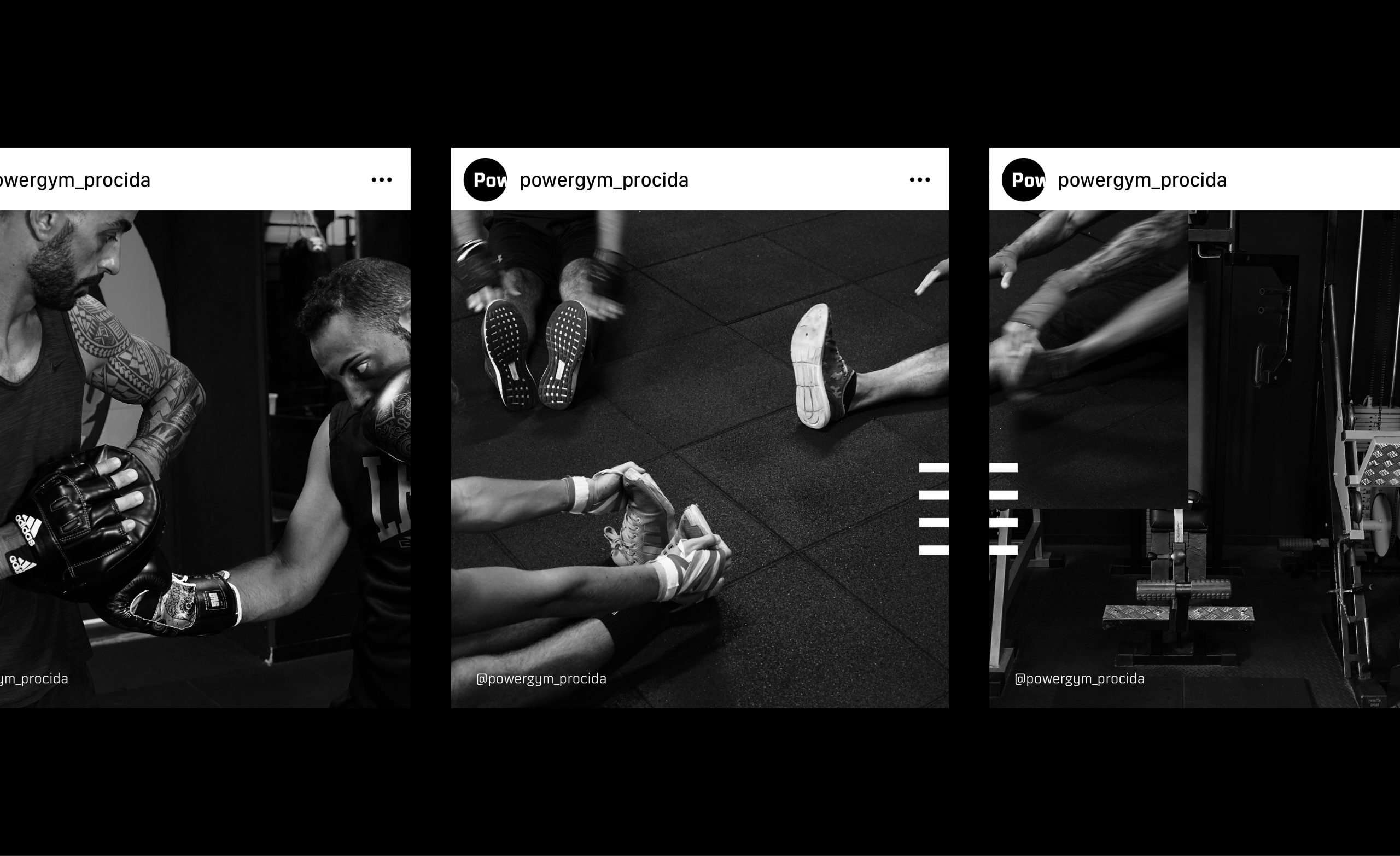
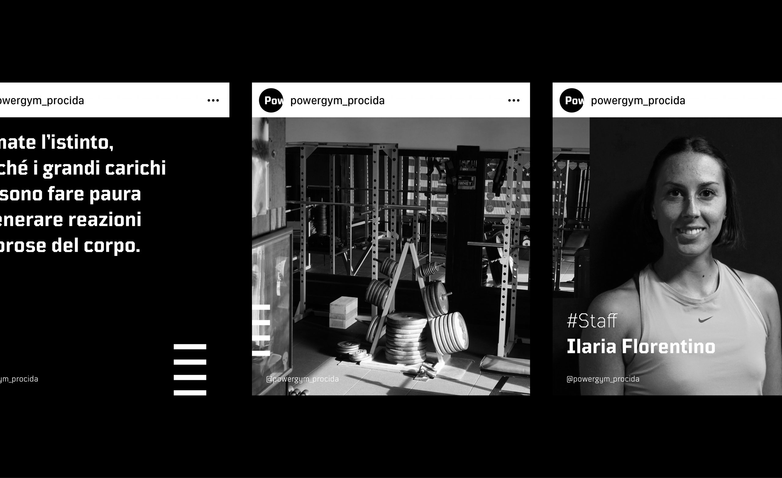
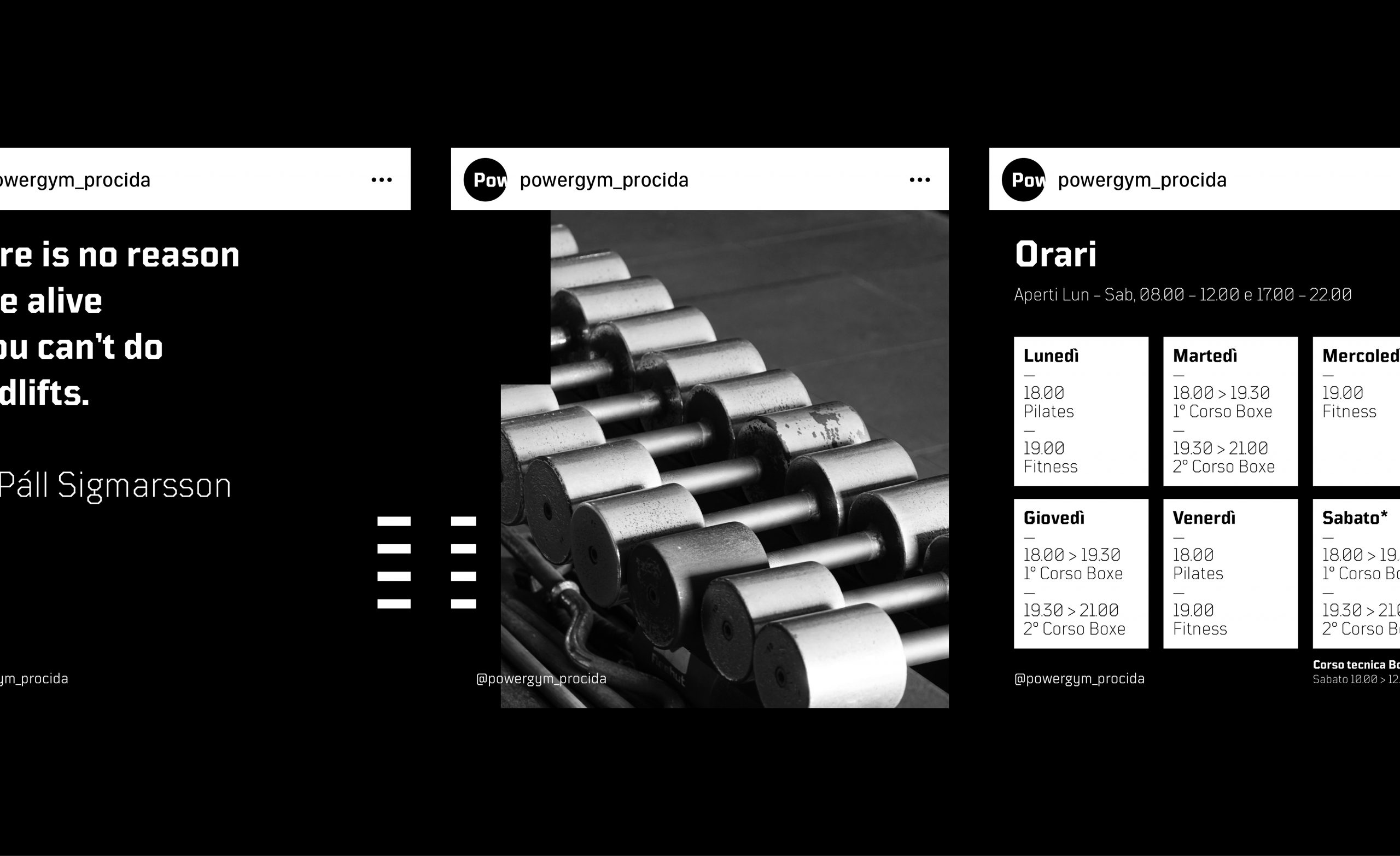
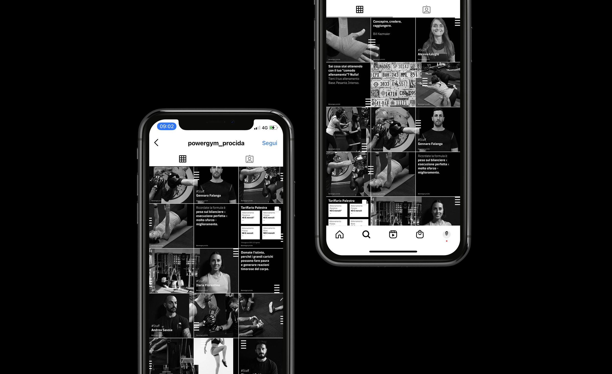
Square typography, impactful photography, but no color. The reduced color palette is based on black, with flashes of white. the vertical stripes create dynamism and connect the images, which sometimes are partially overlapped. On the social media, every post works both by itself and connected with the other, to create a modern and contemporary feed.
Output · Result
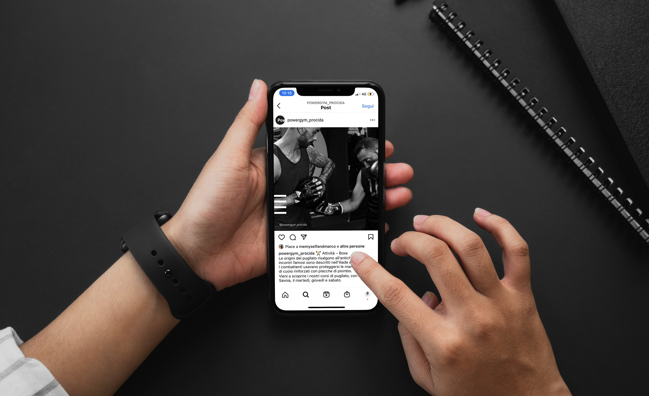
My approach has been simple, as usual: the communication had to be strong, immersive and had to show the world of gym by only using visual contents. The new look and feel has improved the presence online. The result is a bold visual that adds a new dimension on the social media account.
More Projects


